


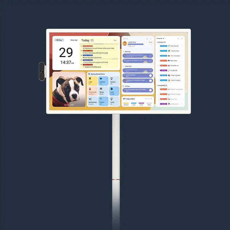




A digital wall calendar only works if you can read it while walking past, not while standing still and tilting your head. Glare breaks that. A matte, anti-glare screen scatters reflected light instead of bouncing it straight back at you, so the schedule stays readable from across the kitchen even when the sun is coming through the window behind you.

Why Bright Rooms Make Calendar Screens Harder to Read
A calendar gets read in glances, not sittings, checked for a few seconds many times a day rather than watched head-on the way a television is.
Glare punishes that pattern directly. On a glossy screen, a bright window or overhead light bounces straight back at whatever angle it hits the glass, and the reflection moves as you move, forcing you to stop and reposition to read it. Kitchens and sunrooms carry the highest risk, since both combine large windows with overhead lighting aimed straight down at counter height, right where a wall-mounted digital wall calendar usually goes.
Matte and Glossy Finishes Solve Different Lighting Problems
A matte finish adds a microscopically textured coating to the glass that scatters incoming light in many directions instead of reflecting it as one sharp beam. A glossy finish does the opposite: it acts almost like a mirror, giving deeper black levels and slightly sharper color when the room is dark, but turning into a reflective surface the moment a bright light source lands on it.
| Condition | Matte finish | Glossy finish |
|---|---|---|
| Direct sunlight or window glare | Light spreads out; screen stays readable | Reflection appears as a bright, distracting patch |
| Overhead kitchen lighting | Minimal hotspot | Visible bright spot at certain angles |
| Dark room, no strong light source | Slightly softer contrast | Deeper blacks, richer color |
| Viewing from an angle while walking by | Readable from most angles | Readable only within a narrow angle |
When Matte Is the More Practical Starting Point
Choose a matte-finish display for any wall that faces a window, sits under direct overhead lighting, or gets used in quick daily glances rather than long, deliberate viewing sessions. That covers most kitchens, breakfast nooks, and open-plan living rooms with south- or west-facing windows.
The result: a screen that stays legible across most of the day as the sun angle shifts, without anyone needing to adjust blinds or lighting to compensate.
When Glossy May Still Fit
A glossy screen can still make sense in a hallway, home office, or bedroom with limited direct light, where richer color and contrast matter more than glare resistance.
In those rooms, a different problem tends to matter more: nighttime brightness. A screen running at daytime brightness in a dark bedroom can feel harsh right before sleep, so a dimmer schedule or a lower default brightness setting is usually the bigger fix, not the screen coating.

The Display Features That Matter Beyond Screen Finish
Screen finish solves the glare problem, but it is not the only spec that determines whether a digital calendar earns its wall space. Size, contrast, and software compatibility all affect whether the household actually reads it every day or starts ignoring it within a month.
Match Screen Size and Layout to the Household
Pick screen size based on viewing distance, not available wall space. A large digital calendar in the 21 to 27-inch range works well for a shared kitchen or hallway, where multiple family members read it from six feet away or more. A smaller 15-inch model is usually plenty for a home office desk or a bedroom nightstand, where the reader sits much closer.

Bigger is not automatically better. A 27-inch display crammed onto a narrow wall next to a doorway can end up partially blocked by an open cabinet or a swinging door.
Check Contrast, Color, and Viewing Angle
High contrast and a wide viewing angle matter more in a bright room than raw brightness alone. A screen with a narrow viewing angle can look washed out the moment you approach from the side rather than dead-on.
Raising brightness can partly offset glare in a sunlit room, but it’s a partial fix, not a substitute for a matte finish. Check the display’s brightness range on the spec page before relying on it, since pushing brightness too high in a dim room creates the opposite problem later in the day.
Verify Interface and Calendar Compatibility
Confirm the display syncs with the calendar accounts the household already uses, such as Google Calendar or Apple Calendar, before assuming every family member’s schedule will show up automatically. A screen that only accepts one account type forces everyone else into manual entry, which is the fastest way for a shared calendar to fall out of date.
Touch responsiveness matters just as much as the sync itself. A screen that lags when someone taps to add an appointment gets used less over time, and a family that stops updating it loses the one advantage a wall electronic calendar has over a paper one.
Place the Calendar Where Light and Traffic Work With It
Test the wall at the times of day it will actually be viewed before you commit to a mounting spot. Morning sun and afternoon sun hit a wall at very different angles, so a spot that looks glare-free at 10 a.m. can turn reflective by 4 p.m.
A few checks make that test concrete:
- Stand where the household usually stands to check the calendar, not directly in front of it, and see whether a window or overhead light reflects off the wall at that angle.
- Check the same wall in the morning, midday, and early evening, since sun position changes the glare risk hour by hour.
- Note any overhead fixture aimed straight down at the mounting spot, since that creates a hotspot independent of window light entirely.
Mounting height and angle interact with glare just as much as the screen coating does. A wall electronic calendar mounted slightly above eye level and tilted a few degrees downward often avoids overhead-light glare that a flat, straight-on mount would catch directly. In a kitchen, common spots include the wall above a counter, a cabinet-facing wall across from the stove, and a wall near, rather than directly facing, a window, which is where an electronic wall calendar display usually reads best.
Confirm the Screen Finish Before You Buy
A matte, anti-glare screen is the right starting point for any kitchen or sun-facing room, and mounting height, angle, and light-source checks matter almost as much as the coating itself. Screen finish varies by model and size within a single product lineup, so check Apolosign’s Digital Calendar product page or spec sheet directly to confirm which sizes carry a matte finish before you buy.
Bright-Room Digital Calendar FAQs
Q1: Does a matte screen reduce touchscreen sensitivity compared to a glossy one?
No, the anti-glare coating affects how light reflects off the glass, not how the touch sensor underneath detects a finger. A matte-finish display should respond to taps and swipes exactly as quickly as a glossy one from the same product line.
Q2: Is a matte anti-glare finish standard across every size in a calendar lineup, or only certain models?
It depends on the manufacturer and often the specific screen size, so don’t assume it. Check the spec sheet for each size individually, since smaller or larger models sometimes use a different panel than the mid-range size.
Q3: Can brightness settings alone fix a glare problem without a matte screen?
Only partially. Raising brightness helps the image compete with reflected light, but it doesn’t remove the reflection itself. In a strongly sunlit room, a glossy screen at maximum brightness can still show a visible glare patch that a matte screen at a moderate setting would not.
Q4: Does mounting height change how much glare affects readability?
Yes, noticeably. A screen mounted at or slightly above eye level and angled a few degrees downward tends to dodge overhead-light reflections that a flat, straight-on mount at the same spot would catch. Testing the exact mounting height at different times of day is more reliable than assuming a standard height will work in every room.
Q5: Do matte screens show fingerprints and smudges more than glossy screens?
Generally less, not more. The same textured coating that scatters light also tends to make smudges and fingerprints less visible than they’d be on a glossy, mirror-like surface, though a display used for daily touch input will still need an occasional wipe-down regardless of finish.